

Primary Projects (stylized Primary.) was born in the early aughts as a collective that would gather local talent to paint murals in the then-burgeoning neighborhood known as Wynwood. Throughout the years, Primary has occupied many locations, but the gallery now has a permanent home in Little River, not far from the train tracks. From the outside, the plain white exterior leaves plenty to the imagination. The interior, however, with exposed concrete paired with fresh white walls and wooden beams overhead, make the space an ideal setting for all sorts of magical and memorable artworks. Founded in 2007 by three friends, artist Michael Gran (who goes by the street name Typoe), Books Bischoff, and Cristina Gonzalez, Primary has exhibited works by national and international artists. Opening this month: a solo show by Typoe — a first for the artist in a handful of years.

Six Questions with Evan Robarts via Tique
Tique asks six questions to an artist about their work and inspiration. This week: Evan Robarts.
How do you describe your own art practice?
The majority of my process happens outside the studio. I’m constantly collecting, recording, and sketching detritus in urban areas which will then collapses into a visual language later on. I lean more towards non-representational forms that build on current events or books I find myself reading.
Which question or theme is central in your work?
The interplay of materials asks fundamental questions regarding the existence and consumer culture. What is man’s relationship to his community, himself, and the planet?
What was your first experience with art?
As a child, I have vivid memories of making drawings on paper which brought me into elevated emotional states. Those moments became the main sale in my life and set a trajectory for my interests moving forward.
What is your greatest source of inspiration?
Clipped bike locks, deflated balls, exhumed gas canisters, and broken broomsticks and scaffolding are a few of the things that fascinate me. I see them as abandoned spirits, the cast-offs of society.
What do you need in order to create your work?
Technically I feel satiated just drawing in my notebook but yes, there are times when I want to tumble objects around in a physical space. I often go through significant stretches of time with no studio so it’s not really a necessity carved into stone. To answer your question though that’s what it would be – a designated space like a studio where I can disconnect from the world and give myself to my work.
What work or artist has most recently surprised you?
Re-discovering Purvis Young’s drawings have been a wave I’m still riding. I grew up in South Florida so there’s a lot of nostalgia for me when I see all the moments and energy he’s channeling.

Evan Robarts - Common Practice - New Book by Skira
Common Practice: Basketball & Contemporary Art is the first comprehensive illustrated publication to explore the relationship between basketball and contemporary art. The collected artworks take readers on a journey to understand the game of basketball not only as a physical activity played between a series of lines, but also as a reflection of a greater human experience.
This hardcover publication from Skira Editore covers more than a century of artwork from over two hundred leading artists—including Nina Chanel Abney, Emma Amos, Romare Bearden, Salvador Dalí, Elaine de Kooning, Keith Haring, David Hammons, Barkley Hendricks, Robert Indiana, JR, KAWS, Titus Kaphar, Jacob Lawrence, Roy Lichtenstein, Sharon Lockhart, Robert Longo, Claes Oldenburg, Paul Pfeiffer, Alex Prager, Richard Prince, Robert Rauschenberg, Faith Ringgold, Lorna Simpson, Andy Warhol, Ai Weiwei, and Wendy White.
Edited by Carlos Rolón, Dan Peterson and John Dennis, with text from Michelle Grabner, Titus Kaphar, and RaMell Ross. Featuring over 300 full-color illustrations.
100% of the proceeds from the Special Edition and Collector's Edition, available exclusively at commonpractice.online support Project Backboard, a non-profit organization that works with artists to renovate and improve public basketball courts around the country. For more information about Project Backboard visit projectbackboard.org.

“Rainbow” - Typoe - 2021
Primary named Best Gallery in Miami
Located in the up-and-coming neighborhood of Little River, not far from the railroad tracks, is a sleek white building nestled in a residential area. You might pass by and not think much of it. But behind this discreet façade is Primary (stylized Primary.), an art gallery founded in 2007 that features works from local, national, and international artists. Its interior, with exposed concrete paired with fresh white walls and wooden beams overhead, make the space feel like the ideal setting for all sorts of works of art. A recent exhibition, titled "Can't Wait to Meet You," was organized to highlight bright, fun works that would be suitable for children. Why, you ask? Because two of its founders, Books Bischoff and Cristina Gonzalez, just welcomed their first child together.

Wade Tullier in Clay Pop at Jeffrey Deitch
Clay Pop, Curated by Alia Williams
September 10–October 30, 2021
18 Wooster Street, New York
Clay Pop documents the reinvention of ceramic sculpture by a new generation of artists. A medium that has often been characterized as more craft than art is now an exciting platform for formal and conceptual innovation. A medium that traditionally diverged from engagement with popular culture is now adding a new dimension to Pop Art.
Paralleling current concerns in painting, many of the artists featured in Clay Pop are also exploring issues of gender, race and identity, using clay in new ways to engage with social issues. Artists are using the medium to create a personal narrative. Clay is being pushed beyond the confines of craft and design.
“Artists are taking a traditional medium and turning it on its head,” says the exhibition curator Alia Williams. An earlier generation of ceramic artists is referenced, but the range of influences encompasses vernacular commercial imagery and artistic sources from African American assemblage to Walt Disney. Much of the new work is exuberant and figurative, expanding on how the medium of clay has been traditionally used. Glazes are especially colorful. Funk art from 1970s Northern California is a source, as is Claes Oldenburg’s store. Some of the artists also draw on artistic influences from the Middle East, Africa and Asia.
Many of the 37 artists in the exhibition know each other, forming a community around this new direction in ceramic sculpture. The community is especially dynamic in Los Angeles, where several of the artists share kilns and studios.
Clay Pop is the first large exhibition to document this new artistic direction. Curator Alia Williams is the Managing Director of Jeffrey Deitch, New York Exhibition design is by Charlap Hyman and Herrero. The artists participating in Clay Pop are:
Diana Yesenia Alvarado, Alex Anderson, Trisha Baga, Alex Becerra, Genesis Belanger, Seth Bogart, Chen Nien Ying, Woody De Othello, Sharif Farrag, Ryan Flores, Dominique Fung, Melvino Garretti, Raven Halfmoon, Kahlil Robert Irving. Elizabeth Jaeger. Devin B. Johnson, Heidi Lau, Grant Levy-Lucero, Candice Lin, Jasmine Little, Lindsey Mendick, Keegan Monaghan, Masato Mori, Ruby Neri, Brian Rochefort, Jennifer Rochlin, Brie Ruais, Sterling Ruby, Sally Saul, Alake Shilling, Adam Silverman, Jessica Stoller, Katie Stout, Magdalena Suarez Frimkess, Wade Tullier, Amia Yokoyama, Bari Ziperstein

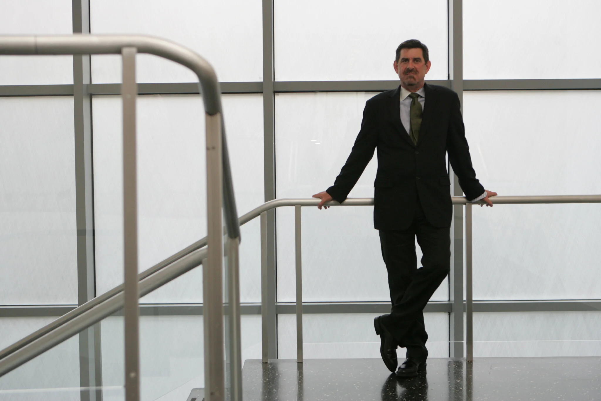
Terence Riley : 1954 - 2021
Terence Riley, Architectural Force in the Museum World, Dies at 66
He was the chief architectural curator at MoMA, overseeing shows and the museum’s massive redesign, then moving on to the Miami art scene.
Terence Riley, who as an architectural curator and museum director was instrumental in bringing to fruition two of the most important works of 21st-century museum architecture, died on Monday at his home in Miami. He was 66.
His family said the death was sudden, caused by an underlying heart condition.
As the chief curator of architecture and design at the Museum of Modern Art, Mr. Riley helped select and guide the Tokyo-based architect Yoshio Taniguchi in the museum’s $858 million expansion, which was completed in 2004.
Later, as director of the Pérez Art Museum Miami, he worked with the Swiss architecture firm Herzog & de Meuron to create a new home for the museum that has been acclaimed for its design and integration into its environment. Along with his museum duties, Mr. Riley maintained an architectural practice, founded in 1984, with John Keenen.
“He always impressed me with his wicked sense of humor and his fierce intelligence,” Glenn D. Lowry, MoMA’s director, said in an interview. “He seemed to remember details about every architect he ever talked to.”
In his 15 years at MoMA, Mr. Riley curated shows on Frank Lloyd Wright and Mies van der Rohe that shed new light on those quintessential modern architects. He engaged contemporary themes in the exhibitions “The Un-Private House” (1999), “Light Construction” (1995) and “Tall Buildings” (2004), bringing attention to architects like Kazuo Sejima, Toyo Ito and Jeanne Gang, who were not yet well known.
Mr. Riley, right, with the MoMA curators Peter Reed and Paola Antonelli in 2004. “He seemed to remember details about every architect he ever talked to,” the museum’s director said.Credit...Michael Weschler for The New York Times
As MoMA proceeded with its massive expansion in the early 2000s, Mr. Riley asked 10 international architects of widely varying fame and sensibility to prepare sketchbook designs, which he then displayed at the museum. The invitees included Mr. Taniguchi, an architect little known outside his native Japan. Mr. Riley urged the museum to accept his design, which reorganized the daunting tangle of additions to the museum home, originally built in 1939, into a coherent whole.
Mr. Riley’s role in the project, Mr. Lowry said, “was to talk with the curators about their ideas and find the right language for Yoshio to understand what they meant.”
Mr. Riley said the Modern’s renovation had whetted his appetite for more such work. Credit...Fred R. Conrad/The New York Times
With overlapping slabs of silvery aluminum, black granite and glass, the new MoMA opened in 2004, adding 252,000 square feet for a total of 630,000, all wrapped around a soaring atrium. The taller and more generously proportioned galleries permitted a refreshingly varied mounting of art, more visual breathing room for each piece, and more space for the ever-growing crowds of visitors.
Nicolai Ouroussoff, reviewing the building in The New York Times, called it “one of the most exquisite works of architecture to rise in this city in at least a generation” and “a near-perfect example of how architecture can be forceful without competing with the art it enfolds.”
Terence Riley was born on Nov. 6, 1954, in Elgin, Ill., to Philip and Mary Jo (Lundberg) Riley. His mother was a homemaker; his father ran a printing business. Terence earned a bachelor of architecture degree from the University of Notre Dame and a master’s degree in architecture and urban planning from Columbia University.
He is survived by two brothers, Dennis and Brian.
Mr. Riley’s curatorial work began when he was chosen to run the Arthur Ross Gallery at Columbia, an exhibition space devoted to architecture. His work there drew the attention of Philip Johnson, who had founded the Museum of Modern Art’s architecture department. Mr. Riley was brought into the department and became the chief curator for architecture and design in 1991.
Later in his tenure, he helped start the MoMA/P.S. 1 Young Architects Program, which showcased early-career architects. Given small grants, the chosen architects created immersive environments in the courtyard of the P.S. 1 Contemporary Art Center in Long Island City, Queens. The exposure, and the MoMA imprimatur, helped launch influential firms like SHoP Architects and WORKac.
“It was his most innovative brainchild,” said Barry Bergdoll, a Columbia professor in architectural history who succeeded Mr. Riley as MoMA’s chief architecture curator.
Mr. Riley left MoMA in early 2006 to become director of the Miami Art Museum (subsequently renamed the Pérez Art Museum). He raised its profile with a series of well-received exhibitions and embarked on an ambitious plan to build a new home for the museum next to Biscayne Bay. He brought in Herzog & de Meuron to design it.
“Jaques Herzog told me the real reason he wanted to do this museum was to work with Terry,” said Mary E. Frank, who was about to become the museum’s board president at the time.
The museum needed to augment public funds with more than $100 million in private gifts. But fund-raising lagged behind, and the project took years. Finally, with plans in place, Mr. Riley stepped down in 2009, returning to the Miami office he had opened for his architecture practice.
The Miami museum, at a cost of $220 million, opened in 2013. Its design was striking for its broad concrete-beam roof overhangs latticed with wood from which long tubes of plantings are suspended like gentle draperies. The overhangs and plantings protect glass walls and outdoor decks — beloved by the public — from the searing sun.
The current director, Franklin Sirmans, said Mr. Riley had guided the architects in making a building well suited to Miami.
“The building never imposes itself upon you,” he said. “It’s not a museum where you stand 56 inches away from a painting and just appreciate. He envisioned a constantly active institution, a community center that is connected to our day-to-day surroundings.”
After Mr. Riley left the museum, he and Mr. Keenen continued to work on projects in Miami, including with the developer Craig Robins, who wanted to channel the energy unleashed by the Miami Art Basel art fairs. “Terry was the architect, but they were also an alliance, scheming together,” said Paola Antonelli, a senior curator at MoMA who remained close to Mr. Riley.
Through his company, Dacra, Mr. Robins transformed a neighborhood of anonymous product showrooms into the city’s Design District, mixing artists with splashy designer boutiques and restaurants. “He saw that art and design would be the new rock stars,” Mr. Keenen said.
Keenen/Riley’s latest project for Mr. Robins was the Museum Garage, whose facade is wrapped with exuberant decorative works by architects curated by Mr. Riley.
“Terry loved design, but he also loved the often complicated process of getting things built,” Mr. Keenen said. “He had more patience than I ever did, as well as the mind and people skills to see things through.”
El Mac Returns to Miami - Public Works
First brought El Mac to paint in Wynwood in 2007 and again in 2008. Excited to have worked with El Mac and Related Group to bring this magnificent mural to Miami. Ten years later, public murals have transformed the identity of Wynwood and influenced endless districts around the world. Cheers to Young Arts for helping connect El Mac with the young creatives included in this mural and cheers to PBS for this killer short.


Philip Smith & Ross Bleckner at Petzel
“The painter constructs, the photographer discloses.” ― Susan Sontag, On Photography
Is a picture a vision observed, then captured by the eye, the mind or another appropriate photographic device? Is a picture a remembrance? A moment, a hope or a desire? A benevolent specter, or, perhaps, simply a social media post? Imagining these impressions, Petzel is pleased to present PICTURES, never-before-seen, unique large format camera works by the painters Ross Bleckner and Philip Smith.
The exhibition encapsulates the artists’ shared interests in technologies of perception, and the mysteries of light. In both bodies of work, the lens becomes a vehicle for the artists to experience and interpret their interior worlds.
“The term photography is so well known that an explanation of it perhaps seems superfluous at this point,” says Bleckner. “But, if that’s true, why does the question ‘What is a photo?’ seem so overwhelming? Maybe because it reflects the world we live in, the information we are supposed to process, the systems that are supposed to organize our social relations.” Says Smith: “I consider each and every photograph a mysterious apparition. All photographs seem to appear from the ether. Yes, we all understand how photographs are created but how a piece of film or a computer can capture a reproducible likeness of reality remains astonishing.”
In 1977, art historian Douglas Crimp organized the seminal Pictures exhibition at Artists Space in New York City. The show included vignette pencil, oil stick and pastel drawings from a then 25-year-old Philip Smith. Crimp was interested in the ability of suggestive, non-specific imagery to create psychological associations for the viewer. And in Smith’s drawings he saw a symbolism which provoked an ethereal response. Both Smith and Bleckner have expanded upon Crimp’s philosophies throughout their careers and share a common and continued interest in the ability of an image to provoke one’s psyche.
Neither Bleckner nor Smith consider themselves photographers. Yet photography is essential to their respective practices as both implement the medium as source material for their paintings. Smith photographs found images from a range of printed ephemera be it science textbooks, spy manuals, or magic books, and so on. He then develops the Tri-X film and projects the negatives onto canvas. Over time, as Smith notes, “the negatives acquire the patina of the studio and become clotted with paint, scratches, and tears.” The works in this show are produced by Smith, scanning the seasoned negatives and printing the resulting image large-scale, in turn becoming both a new work and an artifact of his process. The symbols in Smith’s photographs depict an iconography of scientific abstraction: from infinitesimal atoms, to the DNA strands which compose our inner selves. By further re-abstracting these images, Smith explores the limits of scientific representation, as well as its metaphysical implications.
Bleckner, on the other hand, developed these works by throwing all sorts of light sources (LEDs, laser pointers, flashlights) into the eye of a rarified Polaroid 20x24 camera set at a low exposure. This scarcely found device (only six of these cameras were ever produced) responds to the light in a way that could not otherwise be perceived by the human eye. The Polaroid itself enamours a nostalgic kind of ‘seeing’, fitting for Bleckner who is interested in different modalities of light and how they signal divergent modes of perception. In the pictorial field, light mediates our ability to grasp and distinguish subjects. Yet due to the transience of light, our perception is set in a constant entropy. By attempting to picture light itself, Bleckner examines the concept of ‘inner light’: the light which exists outside of the limited scope of the human eye. And of course, ‘inner light’ is thought to be a way to examine one’s internal processes, psychology, or natural presence.
While painting allows Bleckner and Smith to invent an image, photography enables the simple, and very fruitful, examination of what can and cannot be seen. “Because of their size and their content, my photographs, once printed, become like sentinels to guard the viewer from harm,” says Smith. “They are put there to watch over you.”
Picture that.
Never take a photograph for granted, even those advertising used cars or weekly specials on chicken thighs. Passport photos. Graduation pictures. Christmas pictures of families gathered together. All photographs have a message for you and sometimes if you look at them sideways or upside down you will find the meaning waiting for you. I love looking at the photographs that the drugstores or grocery stores send out. – Philip Smith
A photograph is a piece of captured light that interrogates the dichotomy of knowing when the truth is we don’t know. We are overwhelmed. – Ross Bleckner

The Face on Carlos Valencia
Influenced by pop art, politics and pin badges, the artist’s sociopolitical work is delivered with a wink. His graphite works – inspired by artists from Ed Ruscha to Jenny Holzer – have found a fan in Hedi Slimane.
Brooklyn-based artist Carlos Valencia first discovered graffiti in the early ’90s. He became heavily involved in the scene while living in California. He was obsessed with it – his world revolved around a spray can and a blank brick wall.
Later on, Valencia immersed himself in the big wide world of, what he calls, “classic art”. He was, and still is, drawn to the Westcoast pop artists who emerged in the early 1970s – Ed Ruscha, John Baldessari and Chris Burden and Eastcoast artists like Steven Parrino, Robert Longo, Cady Noland and Jenny Holzer.
Makes sense. Valencia’s work is funny, punchy and accessible, and his appreciation for pop art is apparent. Like Robert Longo’s early ’80s work (see: Untitled (Joe), (1981)), Valencia works with graphite on paper. Take a look at his signature circular drawings – influenced by his affinity for pin badges – for proof. Each comes inscribed with a text slogan, whether that’s “My lust is for life” or “When I die bury me upside down so the world can kiss my ass”. They feel at home next to Ed Ruscha’s postmodern, text-heavy prints, like The Music from the Balconies (1984). Just funnier.
Elsewhere in Valencia’s work, you’ll find twisted depictions of mass American culture: warped graphite renders of Disney characters like Goofy, the Seven Dwarfs and, not so Disney, a rubber duck with two cans of Modelo strapped to its cap. A wink to Warhol, perhaps?
“My work serves as a reflection of past and present culture,” says the 48-year-old artist dialling in from his home-cum-studio. “Pop culture to counter culture, mass market and its subversion.
”Right now he’s inspired by the printed ephemera associated with New York’s underground movements: alternative newspapers and pin badges from the 1960s and ’70s. Through his research, he found that much of the messaging from said decades is as relevant today as it was back then. Environmental and political calls for action have influenced his latest work, like a graphite pin badge inscribed with the words: “Give earth a chance.”
“We like to think we’re at the forefront of these new movements, but we can see that people have been fighting for these changes for decades,” Valencia says.
Last year, Celine’s creative director, Hedi Slimane, approached Valencia to ask him to contribute artwork for the French house’s SS20 collection, which took guests on a road trip back to the rock ‘n’ roll hedonism of the 1970s. Valencia‘s artwork, Uh Huh (2018), features in the collection, embroidered onto a large raffia bag.
Fast-forward to the present and Slimane has selected Valencia – alongside artists, musicians and past-Celine contributors, Lucia and the Best Boys, Joan Jett, Shawn Kuruneru and Oracle Sisters – to feature in the house’s Portrait of an Artist project. Each miniseries sees the collaborator share a snapshot of their time spent in lockdown, during the Covid-19 pandemic.
Valencia was invited by Slimane to create a short video of his time in isolation. In it, he documents his process when creating one of his graphite works, while addressing the current state of the world through its voiceover – something he re-addresses, optimistically, later on:“I’m choosing to use this time [in lockdown] in a positive way wherever possible,” Valencia explains. “Although everything is on hold at the moment, we can keep moving forward which is keeping me going.”
Words: TJ Sidhu

Evan Robarts at Berthold Pott
Evan Robart's "Time Out"
4 September 4 - 3 October 2020
Evan Robarts's solo exhibition Time Out opens on 4 September 2020 at Berthold Pott, Cologne, in conjunction with the Düsseldorf-Cologne Open Galleries Weekend (DC-Open).
For months now, Corona has been an omnipresent part of our lives and has affected all areas of society. Art has also not remained untouched by this and has been strongly pushed into virtual space. How do artists deal with the topic, and in what way does it influence and shape their work?
The US-American artist Evan Robarts, who lives and works in Brooklyn and Miami, has incorporated his observations of social ills in the context of Corona into his new works. These can be seen in a solo exhibition, for which Robarts has chosen the title Time Out , a reference to youth on the one hand and the effect of isolation during the COVID-19 pandemic on the other.
Robarts counters the 'new normality', which is defined by social distancing and the loss of intimacy in interpersonal contact, with symbols of play such as basketballs, children's toys, and bicycles: relics of human interaction in times before COVID-19, which for Robarts refer to a past 'golden era'. The materials used in the exhibition symbolize childhood and youth and at the same time express a sense of melancholy regarding their transience. The attempt to capture something fleeting and the unavoidable loss of youth, which is felt time and again in the course of life, are recurring motifs in Robarts's work.
On an additional level, Robarts's works explore urban space and its effects on the human soul. In the past six months of self-isolation, for example, he collected consumer waste on abandoned lots and in empty buildings in Miami, an unmistakable characteristic of crowded cities, which he reuses in his works. The result is drawings on canvas and sculptures that represent the failed relationship to 'Mother Earth' and to ourselves, as Robarts puts it. According to the artist, 'the materials used are' the remnants of our attempt to find meaning and fulfillment in consumption and material escapism '.
The canvas works executed in oil chalk and charcoal are strongly influenced by Giacometti's drawings of the late 1940s, such as Diego Seated (1948), which create a tension between spatiality, isolation, human location, and loneliness. The work Garbage Wall by Gordon Matta-Clark (1970), in which the artist compressed discarded objects into a sculptural wall, also provides references. Robarts's sculpture Fountain , consisting of the Plexiglas back wall of a basketball hoop, reveals references to Duchamp's The Bride Stripped Bare by Her Bachelors, Even (The Large Glass),from 1915-23. Robarts equips the plexiglass panel with fine, curved steel struts, makes it float, so to speak, and creates a kind of fountain - even a fountain of youth - in which, as described above, the power and vitality of youth are symbolically incorporated.
In Robarts's installation Half Life, one recognizes two large spheres suspended from the ceiling, floating in the air and connected by a chain, which in turn runs over a steel girder under the ceiling. Like scales, the weights seem to balance each other out. Both spheres consist of round metal barrel hoops, which, like an oversized gripping arm, hold a multitude of colorful balls, as if they were locked up together inside. Scattered on the floor below are other balls of various colors and sizes found by the artist on playgrounds and sports fields: basketballs, footballs, small plastic balls that seem to have escaped the metal clamp and fall to the ground. Through the title of the work and the symbolism associated with it, the artist leads us back to the theme of the exhibition: 'Time Out'! Are we clasped and trapped in this crisis, or are the balls still rolling free in the game? What has become of the 'childhoods' and which 'spaces of free play' still exist at all?
While the exhibition attempts to find an artistic response to what has triggered the global crisis, the circle of artistic confrontation is closed with the artist's unavoidable absence at the opening of his exhibition in Germany this September due to entry restrictions.
Evan Robarts: Born 1985 in Miami, lives and works in Brooklyn. Selected Exhibitions: solo exhibition at The Art Factory, Budapest (upcoming 2021), solo exhibition Kunsthalle Bremerhaven, Germany (2020), solo exhibition at Primary, Miami, USA (2020), solo exhibition at Bryce Wolkowitz, New York City (2019 , 2016), solo exhibition at Elliot Levenglick, Los Angeles, USA (2016), solo exhibition at Berthold Pott, Cologne (2018), group exhibition at The Pratt Institute, Brooklyn, USA (2017), group exhibition at Exo Exo, Brooklyn , USA (2016), group exhibition "Not really really" at Fréderic de Goldschmidt Collection, Brussels, Belgium (2016), group exhibition at BANK, Shanghai (2016), group exhibition at Berman Museum, Collegville, USA (2015), group exhibition at Balice / Hertling, New York (2014)


Cultured on Lucia Hierro
Words by Charles Moore
Lucia Hierro’s work is flushed with a tropical sense of color, paying homage to her Dominican heritage. After earning her BFA from SUNY Purchase (2010) and a subsequent MFA from Yale School of Art (2013), she began taking a multimedia approach to her art, exploring issues from class and privilege to exclusion. Today Hierro leverages digital media, painting, installation, collage, color theory and sculpture to showcase everyday items in a way viewers will find striking yet familiar.
The artist explains that her approach took root in her undergraduate days, during which time she began exploring color theory and completed a series of flat-space paintings that were, until recently, kept locked in storage. Looking back on them, Hierro says, these pieces laid the foundation for her future. “I realized there is still a lot that is similar, but now I just have photo-based objects and things,” she explains. Though she now uses digital technology, rather than blank canvases, to bring her work to life, the lively objects and characters displayed in her early work are representative of her collaged, hybrid style. Hierro fondly remembers a Drawing Concepts undergraduate class focused on the significance of seemingly mundane objects, and it doesn’t take a detailed analysis to understand that she carried this notion with her, incorporating it into the majority of her work to date. She claims Spanish idioms began to spark her interest as well; they too have become integral to her practice.
Viewers may recognize her renowned Mercado (market) series, which Hierro began in 2017. The series features soft sculptural works created to resemble translucent tote bags filled with everyday items that, in the artist’s words, “appear a bit off.” There’s a sense of absurdity involved, of mixing and matching pieces that are scaled in such a way that the viewer may linger a bit longer than they would otherwise. Set in contrast to vibrant, domestic backdrops, items like Vicks VapoRub, detergent, canned foods and red solo cups engage the viewer in a discourse of cultural identity, blending personal narratives with overarching socioeconomic issues.
In her 2019 piece The Pastor’s Son Between Auditions, a digital print on brushed suede, felt and foam, it is apparent that the collage is deeply personal, though whether it’s personal to the artist or the subject (or both), one might not know without further context. The piece focuses on the son of a pastor who is aspiring toward bigger things. The objects showcased on the print—apple cider vinegar, a script, an educational book, beaded bracelets, Essentia-brand electrolyte-infused water—all help to tell a story in Hierro’s signature collage style. The same figures displayed in the New Yorker collages (2012–ongoing), the artist explains, were inspired by her early paintings and have incorporated a great deal of her family history. Sewing and feltwork played a key role in her upbringing, and there’s no shortage of these practices in her approach.Describing her trajectory, Hierro describes that she’s set out, perhaps subconsciously, to complicate things over time: to begin with a simple canvas, and to gradually add digital tools and new media to her work. “I think about it like an artist that’s making different albums and figuring out that they could use a loop pedal, and now they’re going to use loop pedals, and then they want to introduce acoustic guitar,” she says. Bit by bit, she’s added new elements to her process, along with new materials, and given herself assignments. Hierro aims to keep things simple yet authentic to her interests, and her usual aesthetic is composed of materials collaged together onto a special material, generally paper backing or fabric, and then reproduced using an inkjet printer. She likes to peel her collaged images off the paper, cutting and sewing them onto machine-sewn fabrics, and hand-stitching her work at times depending on the nature of the composition. From a pair of Nike Air Jordans to lottery tickets, the viewer can both recognize and find meaning in every object on display.
Her work has been lauded as of late. As a 2016 Fountainhead resident in Miami, where she embraced her Dominican roots while taking note of the tensions between her home country and Haiti, Hierro infused her work with a Caribbean style, in an effort to “constantly curate and mold the narrative.” More recently, the artist’s Can I Borrow a Cup of Sugar (2020)—a question often posed among her neighbors growing up—was purchased by the Pérez Art Museum Miami. Simple yet striking, the three-foot-tall sculpture features a simple bag of Domino-brand white sugar. It’s a consumerist, cultural representation of daily life, and of Hierro’s personal experiences.
What does the future look like for her? Hierro is taking things in stride. She is currently collaborating with Art of Change, making prints and donating the proceeds to the nonprofit United We Dream, the largest immigrant youth network in the U.S. In addition, her postponed show at the Aldrich Contemporary Art Museum in Ridgefield, Connecticut, where the artist intends to unveil a series of new sculptures titled The Gates, has been rescheduled for June 2021. Her vibrant socioeconomic commentary and pop art style are not to be missed. She offers an immersive experience with pieces oversized in such a way that the viewer can help but stare, process, and examine.

Lucia Hierro for Public Art Fund
Lucia Hierro (b. 1987, New York, NY; lives and works in The Bronx, New York)The Daily Bread/El Pan de Cada Día, 2020Digital imageCourtesy the artist
For this work, I not only wanted to replicate a bodega but also to highlight the moments which mimic Colmados in the Dominican Republic; depicting baked goods, root vegetables, and other items Americans may not immediately recognize. They function as everything stores but most importantly are a place where neighbors commune. The survival of these small businesses is so important to me. These spaces offer a little piece of home to those from the island.
——————>
Art on the Grid responds to this historic moment. Our lives have been completely transformed by the devastation of a global pandemic and the rise of one of the largest social justice movements in modern history. This spring, Public Art Fund invited 50 emerging New York-based artists to reflect on the current situation as a way to help our communities process the challenges we face together. In different ways, COVID-19 and the renewed urgency over systemic racism that led to protests in our streets and a movement for change have reshaped our day-to-day lives including the ways we interact and experience our city. The exhibition gives a highly visible public platform to artists whose regular creative outlets have been stifled, commissioning them to make new, responsive works of art. Art on the Grid enables the people of New York to reflect, to engage with the city in new ways, and to begin conversations with neighbors, friends, and strangers alike.
The exhibition roster features 50 artists from 18 countries. The artists were prompted to respond to the broad themes of reconnection and renewal, interpreted through their different perspectives and personal narratives. The resulting works draw on their experiences of New York City, its people, and places. They include reflections on moments of spontaneity, intimacy, isolation, loss, healing, and rebuilding, as well as aspirations to create a more just, inclusive, and equitable future. Now more than ever, public art–open, free, and accessible to all–has the ability to serve as a vital tool in the creative and spiritual recovery of our city.
The 50 artworks in Art on the Grid form a decentralized group exhibition on the city’s public transportation and communication infrastructure. Launched in two phases—on June 29 and July 27—the works are housed on 500 bus shelters’ advertising panels and on more than 1,700 wifi kiosks’ digital screens located across the five boroughs. Clusters of works by multiple artists along a bus route are intended to create new art viewing itineraries or simply to enliven the days of those who encounter them fortuitously. The captivating works conceived by these artists re-envision the city itself as an outdoor gallery, reminding us that even in times of adversity, artistic expression is indispensable to the creation of a culture that truly reflects and responds to our contemporary world.
Art on the Grid is curated by Public Art Fund Director & Chief Curator Nicholas Baume, Public Art Fund Curator Daniel S. Palmer, and Public Art Fund Assistant Curator Katerina Stathopoulou.
The first group of ten new artworks unveiled on June 29 are by Firelei Báez, Arielle Bobb-Willis, Elliott Jerome Brown Jr., Rafael Domenech, Chase Hall, Doron Langberg, Sharon Madanes, Emily Mae Smith, Cynthia Talmadge, and Andre D. Wagner.
The second group of 40 new artworks unveiled on July 27 are by Nina Chanel Abney, Tunji Adeniyi-Jones, Kamrooz Aram, Leilah Babirye, Chloë Bass, María Berrío , Elizabeth Bick, Zach Bruder, Jordan Casteel, Sara Cwynar, Jeremy Dennis, Marley Freeman, Ivan Forde, Chitra Ganesh, Oto Gillen, Baris Gokturk, Lucia Hierro, Esteban Jefferson, Yifan Jiang, Cheyenne Julien, Adam Khalil, Baseera Khan, Andrew Kuo, Sophie Larrimore, Nate Lewis, Joiri Minaya, Willa Nasatir, Jordan Nassar, Madhini Nirmal, Stephen Obisanya, Danielle Orchard, Anna Ostoya, Anna Park, GaHee Park, Jamaal Peterman, Kameelah Janan Rasheed, Adrienne Elise Tarver, Salman Toor, D’Angelo Lovell Williams, and Wong Kit Yi.
Seeking to broaden our reach and assemble a group of 50 outstanding emerging artists who collectively reflect the richness and multiplicity of New York City’s artistic community, Public Art Fund’s curatorial team invited 30+ colleagues to submit names for consideration. These nominators include artists, curators, cultural leaders, and luminaries from academia and cultural non-profits. Through this process we were able to rapidly identify an extraordinarily diverse group of artists, while simultaneously deepening connections with peers in the field at a moment when so many of us felt disconnected by the pandemic.
With heartfelt thanks to our remarkable colleagues for their contributions: Cecilia Alemani, Donald R. Mullen, Jr. Director & Chief Curator of High Line Art; Farah Al Qasimi, artist; Miguel Aragon, Assistant Professor, College of Staten Island, The City University of New York; Tauba Auerbach, artist; Jessica Bell Brown, Associate Curator of Contemporary Art, The Baltimore Museum of Art; Isolde Brielmaier, Curator-at-Large, International Center of Photography (ICP); A.K. Burns, artist; Emma Enderby, Chief Curator, The Shed; Adriana Farmiga, artist; Andrea Geyer, artist; Jeffrey Gibson, artist; Thelma Golden, Director and Chief Curator, The Studio Museum in Harlem; Hugh Hayden, artist; Carmen Hermo, Associate Curator, Sackler Center for Feminist Art, Brooklyn Museum; Matthew Higgs, Director, White Columns; Shanay Jhaveri, Assistant Curator, International Art, Modern and Contemporary Art at The Metropolitan Museum of Art; Ruba Katrib, Curator, MoMA PS1; Martin Kersels, Director of Graduate Studies in Sculpture, Yale; Thomas Lax, Curator, Department of Media and Performance, Museum of Modern Art; Christopher Y. Lew, Nancy and Fred Poses Curator, Whitney Museum of American Art; Jennifer McGregor, Senior Director of Arts, Education and Programs, Wave Hill; Alan Michelson, artist; Ugo Rondinone, artist; Walid Raad, artist; Xaviera Simmons, artist; Sarah Sze, artist; Kelly Taxter, Barnett and Annalee Newman Curator of Contemporary Art, The Jewish Museum; Mickalene Thomas, artist; Mark Tribe, MFA Department Chair, SVA; Tomas Vu, LeRoy Neiman Professor and Artistic Director, LeRoy Neiman Center for Print Studies, Columbia University; Jasmine Wahi, Holly Block Social Justice Curator, Bronx Museum of the Arts; Hank Willis Thomas, artist.


